Friday, 5 April 2013
EVALUATION Q6) What have you learnt about technologies from the process of constructing this product?
TECHNOLOGY USE 1 - RESEARCH

For the majority of the 'research' part of this coursework, I had to use Google to search for websites, such as Wikipedia and Art-of-the-title. Without Google, I would have to find information from library books, which would take a very long time and is very boring.

I used Wikipedia to search for some basic facts about the film industry, which included information about a film's plot, as well as many jobs in the media industry, including marketing and production companies. I also searched Wikipedia to work out what genre of film would be best for me and thanks to it, I believe the information I've included is very effective and it has helped me improve my knowledge on the film industry.

For the 'Art-of-the-title' title sequence task, I had to find an opening sequence of a film with the same genre as mine. There were a wide range of titles to choose film, but for me personally, I chose 'This is England' because it is a very good film and it is a genre of film which is the same as mine (drama). Without Art-of-the-title, it would make this task extremely hard because there is no other site with a speciality of 'opening sequences'.
 'YouTube' was a vital part of this coursework, especially for the analysis on an opening sequence of your choice. I had to watch the opening sequence and write down about the mise-en-scene, sound, camera and editing of that clip. The knowledge on this has made an impact of the cousrwork and throughout Media altogether.
TECHNOLOGY USE 2 - FILMING AND EDITING
'Final Cut Pro X' was one of the most vital parts of the whole piece of coursework because this software was used to edit the footage that I had filmed. I used so many different methods to make my opening sequence including the 'Blade' tool to shorten each piece of footage filmed, the 'T' tool to add titles to the clip and the 'I, O and F' tools to sort out what parts of the footage I wanted in my opening sequence. Overall, this piece of software has really increased my confidence into editing.
I used this device to record the dialogue I needed for my opening sequence. As I had only piece of dialogue, it wasn't really a hassle and it was very easy to do. I could easily transfer the data from this microphone to 'Final Cut Pro' and is now included in my opening sequence. It was fun and very easy to use.
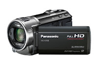 For the 'filming' part of the task, I used a 'Full HD Panasonic camcorder' to film all of the camera shots I needed for my opening sequence. This technology was fairly simple to use, although I did have a problem with the battery, as it was on low, which meant that my shooting schedule had to be slightly adjusted to a different time. To film the scenes and the camera shots as professionally as possible, I also used a tripod to adjust the height of each shot, whether I was sat down or stood up. I used this to prevent the camera from shaking and this instrument is better than holding it in your hand. I found using the tripod very easy, as I used it before in my preliminary task and other practical work and I found that my work is very effective after using these equipment.
TECHNOLOGY USE 3 - BOTH
To be able to do most of the tasks and to create this blog, I needed to use a Mac or Computer. Typing is much better than writing down, when presenting this work because it's quicker to do and it is more creative and fun. The Mac is also home to a wide range of information I need to research and to complete the tasks set by the tutor.
Blogger was the most frequently used website because this is the place where my blog was written. I learnt a lot while blogging, as this was the first time I've ever blogged and I'm going to consider blogging more in the future. The tutor was so helpful with helping us to blog. This is much better than other methods, such as writing down notes because it is more unique and this tends to be more easier and it can be viewed from all over the internet; around the world.
Finally, Prezi is a website where you can present your work in a more stylish, creative way, similar to Microsoft Powerpoint, but with more room to work on. I've used this on a few task to vary the way I present things, rather than just using Text and Image. I found this very useful and as well as Blogger, I will consider using it in the future, whether at university or just bored in my free time.
In my opinion, without technology, I would present my information in a less creative and boring way. The Internet and technology, in general, is open to a wide range of ideas.
EVALUATION Q5) How did you attract/address your audience?
For this task, I've added annotations to tell you about how my film contributes to the target audience of my film. I will refer to genre conventions, use of music and what I have identified as the USP of my imaginary film.
Here it is:
Here it is:
EVALUATION Q4) Who would be the audience for your media product?
For my media product, I have established, over a heck of a load of blogs, that the audience of my film would be 45-54 year old women because they are the most likely age range/gender to go and watch a drama film, whether if it's historical or romantic.
As this chart shows from the 'Statistical Yearbook 2012' by the BFI, we can see that the 45-54 year old age range would go to see films that are based on an historical event through drama, mystery or even action. However, the 'Age group % of the film's total audience' is below a fifth of all of the whole audience of the film because the typical age range are least likely to go to the cinema to watch a film and are more likely to buy it on DVD and watch it on the television. Our age range is known as a niche audience. As this is an independent film, the target audience would be able to receive word-of-mouth through film festivals, which helps the target audience to raise awareness and obtain donations for funding in future projects.
What sort of media would the '45-54' age range consume?
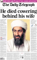 When talking about the use of media for 45-54 year olds, the way they consume different types of media is somewhat very different compared to a teenagers consumption. They tend to consume newspapers, such as the Daily Telegraph, the Times and the Independent, as well as magazines, such as What's on TV, Chat and Take a Break. People of these ages are more likely to listen to the radio also, with radio stations including Magic, BBC Radio's 3 and 4 and Heart FM. Finally, they would watch TV such as Coronation Street, Long Lost Family and historical dramas such as Downton Abbey and Mr Selfridge, as well as sometimes using Facebook.
 The reason for this consumption is because they want to explore certain ideas they haven't explored before and to gain capacity for judgment, free-thinking, questioning and understanding of their interests. They want to form on-screen relationships with characters, as well as gaining information about them in newspapers and magazines alike. The typical age range tend to consume media in a resilient way, examples include to be entertained by different sources of technology and to decrease boredom.
As this chart shows from the 'Statistical Yearbook 2012' by the BFI, we can see that the 45-54 year old age range would go to see films that are based on an historical event through drama, mystery or even action. However, the 'Age group % of the film's total audience' is below a fifth of all of the whole audience of the film because the typical age range are least likely to go to the cinema to watch a film and are more likely to buy it on DVD and watch it on the television. Our age range is known as a niche audience. As this is an independent film, the target audience would be able to receive word-of-mouth through film festivals, which helps the target audience to raise awareness and obtain donations for funding in future projects.
What sort of media would the '45-54' age range consume?
 When talking about the use of media for 45-54 year olds, the way they consume different types of media is somewhat very different compared to a teenagers consumption. They tend to consume newspapers, such as the Daily Telegraph, the Times and the Independent, as well as magazines, such as What's on TV, Chat and Take a Break. People of these ages are more likely to listen to the radio also, with radio stations including Magic, BBC Radio's 3 and 4 and Heart FM. Finally, they would watch TV such as Coronation Street, Long Lost Family and historical dramas such as Downton Abbey and Mr Selfridge, as well as sometimes using Facebook.
  The reason for this consumption is because they want to explore certain ideas they haven't explored before and to gain capacity for judgment, free-thinking, questioning and understanding of their interests. They want to form on-screen relationships with characters, as well as gaining information about them in newspapers and magazines alike. The typical age range tend to consume media in a resilient way, examples include to be entertained by different sources of technology and to decrease boredom.
EVALUATION Q3) What kind of media institution might distribute your media product and why?
For this task, I've decided to use 'Prezi' because I can present this question better using a different source of technology and it hasn't been used a lot on this blog.
So here goes:
So here goes:
EVALUATION Q2) How does your media product represent particular social groups?
In this question, I will be talking about my character and comparing it with another character from a film, which has similar features by their personality and dress sense.
As there is only 1 character from my opening sequence, I won't need to talk about the different personalities of another character in my film.
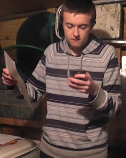
The main character of this film is Joshua Staples, a shy, young man, who portrays himself as a loving, caring person. He is an only child and lives with his mum, as his dad split up with her, while she was pregnant with Josh. His dad moved away from the UK and has never came back to see his son.
For this task, I am comparing Joshua with 'Eastenders' regular character Arthur 'Fatboy' Chubbs because I believe he has a similar personality to my main character of the film's opening sequence. First of all, both of the characters are wearing hoodies, suggesting to some people that they may be threatening to the public. But, on the other hand, they have a completely different, more caring side to them, as most people would describe hooded people as scary or nasty people. They both have a special relationship with another person (Josh with his father and Fatboy with his girlfriend). These two characters are portrayed not as bad or humiliating, but as popular, soft hearted characters, which is a similarity.
They are both of similar age (late teens or early 20s) suggesting that their style are similar to a teenagers style, especially their clothing. Their hair is also short, referring back to a chav or a gangsta's sense of style as they tend to have short hair. With 'Fatboy', his speech is more informal and tends to talk like a teenager ('Bruv' and 'Innit' are 2 clear examples of the words the character uses in Eastenders). These features are not seen in my film, as my character portrays himself as independent and prefers to be on his own.
As there is only 1 character from my opening sequence, I won't need to talk about the different personalities of another character in my film.

The main character of this film is Joshua Staples, a shy, young man, who portrays himself as a loving, caring person. He is an only child and lives with his mum, as his dad split up with her, while she was pregnant with Josh. His dad moved away from the UK and has never came back to see his son.
For this task, I am comparing Joshua with 'Eastenders' regular character Arthur 'Fatboy' Chubbs because I believe he has a similar personality to my main character of the film's opening sequence. First of all, both of the characters are wearing hoodies, suggesting to some people that they may be threatening to the public. But, on the other hand, they have a completely different, more caring side to them, as most people would describe hooded people as scary or nasty people. They both have a special relationship with another person (Josh with his father and Fatboy with his girlfriend). These two characters are portrayed not as bad or humiliating, but as popular, soft hearted characters, which is a similarity.
They are both of similar age (late teens or early 20s) suggesting that their style are similar to a teenagers style, especially their clothing. Their hair is also short, referring back to a chav or a gangsta's sense of style as they tend to have short hair. With 'Fatboy', his speech is more informal and tends to talk like a teenager ('Bruv' and 'Innit' are 2 clear examples of the words the character uses in Eastenders). These features are not seen in my film, as my character portrays himself as independent and prefers to be on his own.
Sunday, 24 March 2013
EVALUATION Q1) In what ways does your media product use, develop or challenge forms and conventions of real media products?
As shown above, I will be using these 9 frames to compare different elements of media (Mise-en-scene, Sound etc.) to a film of a similar genre to mine. I believe that my media product successfully matches and also challenges forms and conventions. I've included elements of both a romantic and drama film, as my product involves both of these genres, as it is aimed to be a 'romantic-drama'. This film portrays romance in a different, more unique way to other romantic-dramas, as this is based on more family-related stuff, rather than a love story between a couple.
I will also explore how I did certain elements of my film's opening sequence and compare them with other films with a similar opening storyline and titles.
Film Ident:
 Both mine and the professional film ident 'Universal Pictures' have very similar features. First of all, the setting of both of these idents are in the same place, but focuses on different planets. Both of the idents also include more information about the company of which the ident comes from and are adopted by. Mine is 'Walker Pictures Entertainment' and Universal's is 'Comcast'.
 However, there are some differences, including the fonts. I have used a somewhat 2D font, whereas 'Universal' had more time to work on the font of their ident and so it looks 3D and more stood out. 'Universal' has used the colour scheme Yellow and White, whereas mine is just pure white.
Main Film Title:
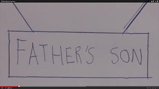
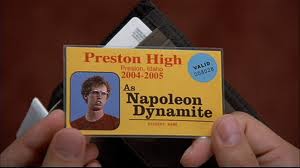
Both the professional titles of 'Napoleon Dynamite' and my own titles have both constructed that they have been done by hand and have not used titles from a particular program to show the titles. We have also used the right colour font to be shown on an appropriate background e.g. dark writing on a light background or the opposite. This has been constructed well and the titles can easily be identified because of this technique. The titles both appear near the start of the opening sequence, which is a similarity and probably to other drama films.
Setting/Location:
In my opening sequence for 'Father's Son', the setting is easily identified after the above-the-line talent credits are shown. The setting is shown in a wide range of camera shots, especially with the long shot. The whole part of a long shot is to show the whole character (top to toe) and also to identify the scene.


In 'Napoleon Dynamite' however, the setting and location is not fully identified. The only thing you see, as well as the titles, are different colored and materialized carpets, suggesting that the film's opening sequence is set in a living room, but the audience do not know that.
Camera/Editing:
There is a big difference between my final cut and 'Napoleon Dynamite'. In my opening sequence, I've used a range of continuity editing, such as jump cut and eye-line match, whereas in 'Napoleon Dynamite', there is only one piece of continuity (jump cut) between each carpets shown. As well as this, 'Napoleon Dynamite' has also used just one camera shot throughout, whereas in my opening sequence, I've used a wide range of camera shots to tell the story of my film. Two of these examples are the close-ups, when showing the character's reaction from reading the letter and his dad's number on the phone and also the point-of-view shots, when the protagonist is looking at the main props of the film's opening sequence. This creates effect for the viewer, by understanding the plot more clearly.
Title Font and Style:
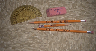 When looking at these 2 film's use of titles in their opening sequence (mine above and 'Napoleon Dynamite' below) we can see some similarities. The titles are near enough positioned in the same place (right in the centre of the screen) but the fonts look a little bit different. The titles are both hand-written, which is a similarity. The way it is written is both linked to a character or object ('Fathers Son' uses written text to refer to the font of the letter, which is a key prop for the film and 'Napoleon Dynamite' uses written text to refer back to the main character, who daydreams his way through school and draws ligers and other fantasy creatures). The titles in 'Napoleon Dynamite' appears almost in the same order as my film's opening sequence, with most of the title's hand-written on paper or doodling the plate using different creams and sauces etc.
Saturday, 23 March 2013
Friday, 22 March 2013
Tuesday, 19 March 2013
Friday, 15 March 2013
Editing Diary Entry - Thursday 14th and Friday 15th March
Today, I made final changes to the 'final cut', from feedback given in my 'rough cut'. As well as this, I re-filmed the titles of the 'rough cut' to make it more effective and to fit the criteria of the opening sequence and I also filmed some extra parts, which weren't included in my 'rough cut'. I also cut some footage out, that weren't appropriate for the 'final cut', especially with the letter scene.
I re-structured some parts of the opening seuqence to make way for some other extra parts, such as other titles or footage that was filmed in the classroom.
Finally, I changed the music at the end because the audience though it was too dramatic and that it did not have a smooth transition.
I re-structured some parts of the opening seuqence to make way for some other extra parts, such as other titles or footage that was filmed in the classroom.
Finally, I changed the music at the end because the audience though it was too dramatic and that it did not have a smooth transition.
Thursday, 14 March 2013
Rough Cut Feedback
The main reason for producing a rough cut for my opening sequence is for people to watch it and to give feedback based on the 4 main areas of media: sound, mise-en-scene, editing and camera. At first, I gave a point about my opening sequence that I haven't completed or I've done wrong and needs improving. Here is the feedback that was given by the viewers of my opening sequence:
- The title music was better than what it was before.
- Include plane tickets, maybe, to show that the young man is ready to leave for his father.
- The music: too much difference between the different styles of music included in both the letter scene and phone scene.
- 'Gazing into your eyes' - too romantic.
- Letter is emotional - tear to Liam's eye.
- Title sequence - effective way, but jumps a little bit.
- Smoother transition - less dramatic.
- Variety of different angles used.
- Like the photos part near the start of the sequence.
I will now make all of these changes and add the rest of the titles, so the audience can get a gist of the whole story. These changes, hopefully, will be seen in the 'final cut'.
Editing Diary Entry - Tuesday 12th March
Today, I had to finish the rough cut of my footage, so that it could be watched by other students and so the video can get effective feedback from the other students. Although some people didn't want to be in the room, while the other students were watching each person's opening sequence, I decided to stay in the room to watch my piece. Not only I was given feedback, the other students received feedback from me and other peers.
My 'rough cut' will be uploaded in the next post.
My 'rough cut' will be uploaded in the next post.
Thursday, 7 March 2013
Editing Diary Entry - Tuesday 5th and Thursday 7th March
(Top Centre) - 1st Part of opening sequence on timeline.
(Bottom Centre) - 2nd Part of opening sequence on timeline.
^^^^Work from Thursday 7th March
Tuesday 5th March:
After finishing filming the footage for my opening sequence, I have uploaded them on to 'Final Cut Pro' and I started to put them together in the ideal order from my script. I viewed through them to see which ones were rubbish and which ones were good for my opening sequence. I got rid of the footage that were rubbish or were useless.
Next time, I will begin to add titles and music to my sequence, as well as making changes from feedback given from a tutor. I will also make footage shorter, as my original uploading lasted 3 and a half minutes.
Thursday 7th March:
Next time, I will finish all of the tasks that my tutor has set me and to upload my rough cut on to the blog.
Filming Diary Entry - Monday 4th March
Today, I filmed the final 5 shots of the opening sequence (18-22), which includes the moment when Joshua goes to phone his long lost father. Today was the 4th and final day of filming and the 5th day of production overall. What went well today were the accuracy of the shots; they were perfect and also I finished the filming just a day before the deadline date.
There are no plans needed for next time, only for editing and producing the 'rough cut' and 'final cut' of the opening sequence.
There are no plans needed for next time, only for editing and producing the 'rough cut' and 'final cut' of the opening sequence.
Thursday, 28 February 2013
Filming Diary Entry - Friday 1st March
Today, I encountered a big problem whilst filming the remaining 9 shots of the opening sequence. 4 shots in to the filming, my camcorder ran out of battery and I had no charger to charge the battery. As this happened, I can't film until I get a battery charger for the camcorder. The rest of the shots will hopefully be filmed on Monday night.
Filming Diary Entry - Thursday 28th February
Today, I filmed shots 9-13 of my opening sequence, which includes the opening of the envelope to the point where the protagonist smiles. These frames from my storyboard above contributes with my work for which I have completed today. Today was the 2nd day of my filming schedule and my 3rd day of production overall. What went well for today was the fact that all of the shots included are exactly what I wanted it to be (the right use of camera terms e.g. close-up for the protagonist smiling).
My plans for next time is to use the help from the volunteer to position the camera and the tripod in the exact position I want it in. Not many more changes are needed for this section of the filming. It is all running smoothly.
The pictures below show the 2nd day of filming for my opening sequence:
Filming Diary Entry - Wednesday 27th February


Yesterday, me and a volunteer filmed the first 8 shots of the opening sequence, with the help of a cam-corder and a tripod. The first 3 storyboard frames used in my storyboard we're portrayed on camera yesterday. This was our first major filming day and I will need another 2 days to film the remaining camera shots. As it was our first day and it was time to move the props in to the shed, I found that all the equipment were in the right place at the right time. I thought it was going to be much worse. Also, I had a volunteer working with me to film these shots, which worked very well with the structure of my opening sequence.
The plans for next time is to work on my camera shots more carefully. Some shots did not match the expectations to my storyboard and some parts of the script were portrayed differently in the filming.
Below are the pictures of the opening day of filming:
Filming Diary Entry - Tuesday 26th February
On Tuesday, I recorded the dialogue needed for my opening sequence, using the 'H2 Handy Recorder'.
There is only going to be one part of dialogue of the film's opening sequence and this will happen when the man reads the letter, with the voice-over of dialogue in his head. The dialogue comes from the voice of the father, who is a key member for the rest of the film.
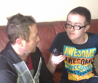 The photo (shown left) shows me and my dad recording the sound for my opening sequence. The strengths from this day of recording is that it was recorded several times to get the perfect sound for my film's opening sequence. No changes are needed to improve this part of the task.
There is only going to be one part of dialogue of the film's opening sequence and this will happen when the man reads the letter, with the voice-over of dialogue in his head. The dialogue comes from the voice of the father, who is a key member for the rest of the film.
 The photo (shown left) shows me and my dad recording the sound for my opening sequence. The strengths from this day of recording is that it was recorded several times to get the perfect sound for my film's opening sequence. No changes are needed to improve this part of the task.
Changes Made to 'Shooting Schedule'.
I have made some changes to my shooting schedule that I've constructed. First of all, only the dialogue was done on Tuesday 26th February because of the issues with setting up the equipment in our location. Instead, I decided to film the first 8 shots on Wednesday 27th February. I was not free that day, but with cancellations put in place, I was free for the nighttime. On Friday 1st March, I had problems regarding my camcorder, as it ran out of battery with only 5 shots to complete before the filming was finished. The rest of the other were completed on Monday 4th March, thanks to the supply of a charger.
The rest of the filming ran as normal.
The rest of the filming ran as normal.
Animatic Storyboard and Action Plan
Action Plan:
When filming my opening sequence, I need to consider an 'action plan'. Action planning is a process which will help you to focus your ideas and to decide what steps you need to take to achieve particular goals that you may have. The 'judging criteria' of this opening sequence is carried out by the moderator. The judging criteria is listed as followed:
- Draws audience in/engaging storyline X
- Variety of camera shots X
- Use of conventions (genre) X
- Continuity in editing X
- Mise-en-scene: Attention to/care X
- Use of sound. Is it effective? X
- Material appropriate for the target audience and task.
- Using titles appropriately according to institutional conventions. X
X - Used in the images/annotations above.
As shown above, almost all of the criteria meets the images and annotations in the video. I haven't included the material appropriate for the task and also the target audience. Because of this, I need to make an action plan. Preparing an action plan is a good way to help myself to reach my filming objectives. A 'romantic drama' and a '12 Film' can contain:
- Mature themes
- An engaging storyline relating to the idea of 'romance'.
- Music, which matches the age range, such as orchestral music.
- Scenes which can emotionally hit the audience.
- Should contain features of which a 12 year old would be recommended to watch e.g. moderate strong language and sexual references.
The features should relate to the plot and genre of the film. I will construct that feature to it's extent, so when it is finished and released to the public, they can identify this efficiently.
Tuesday, 26 February 2013
Shooting Schedule
The table above is the shooting schedule that I have constructed, so I know what days I am free and what shots I am going to film for each day, as well as the equipment needed and the location of the opening sequence. I have chosen to start filming at 6:30pm because this is the time when it's pitch black and the light inside the shed is brightest at night.
Thursday, 14 February 2013
Location Scout
The location that I have chosen to use when filming my opening sequence is my shed, located at my house in the Bournville, Weston-super-Mare. I have chosen this location because it matches the personality of my character and it links well with the plot for my opening sequence. The shed will act like an office for my protagonist. The shed does not look untidy now, but when we come to film it, it will look cluttered with crisp packets and cans of Lager. This shows that the character of the film has no sense of motivation for cleaning. The shed is shown to be very small and non-decorated, also showing a lack of motivation for my protagonist. The shed will also contain the props I need, when I come to filming my opening sequence.
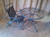 This picture is where the main character will sit and the table is where the main character will rest the most important props e.g. the shoe box and his mobile phone. The table will remain mostly clean, with a few cans and wrappers. This could show that the character has a clean side to him, when it comes to cleaning his table, as it has a little area space.
This shows the outside of the shed of where the opening sequence will be based. None of the shots will be filmed outside but the structure has a resemblance to the inside of the shed. It is not decorated and looks very dull because the material of the shed is showing the original color.
Props and Costume
Props:
- Glass Garden Table and matching Chair - This is for Joshua to sit down and to rest his props on the table.
- Shoe box - This is the safe place of where Joshua's personal stuff is kept. The shoe box represents Joshua's poor background.
- Envelope - To keep the letter in, before Joshua reads it.
- Letter - For Joshua to read in the voice-over scene.
- HTC Wildfire mobile phone - This is used when Joshua goes to call his father (or does he?).
- Family photos - For Joshua to look at near the start of the opening sequence.
- Family tree - To present the title of the film and the above-the-line talent.
- Camera - Used by me and a volunteer.
Costume:
The main character will be wearing scruffy, dirty clothes. This will match the setting of the opening sequence, which contains loads of tools and useless equipment. This costume has the connotation that the protagonist comes from a poor background. Despite having enough doll money to spend on new clothes, he finds it hard to get out of the house and instead saves it for an airplane. This is all the costume needed, as there is only 1 character involved in the opening sequence.
Diary Entry #3
Dear Moderator,
I am now going to work on the costume/props list for my opening sequence and also the location scout of where the setting of my opening sequence will be. These are very important when working on my opening sequence, so the audience get an idea of the exact information of the props and the locations involved.
I am now going to work on the costume/props list for my opening sequence and also the location scout of where the setting of my opening sequence will be. These are very important when working on my opening sequence, so the audience get an idea of the exact information of the props and the locations involved.
Wednesday, 13 February 2013
Shot List
Another important element for my film opening is a camera shot list. The shot list is very important because it gives the opening sequence an effect and an insight of what will happen in the filming. This helps introduce the characters, setting and the tension in the plot of the film.
The shot list is as followed:
Shot 1 - High-angle and panning shot of the floor and table.
Shot 2 - Close-up shot and panning shot of the drawing of a family tree, which reads the title of the film and the above-the-line talent.
Shot 3 - Close-up and point of view shot of Joshua looking at the photos of his father.
Shot 4 - Match on action and close-up of Joshua looking at the photos, with the camera focused on Joshua.
Shot 5 - Long shot of Joshua putting down the photos and then opening the box of personal things.
Shot 6 - Close-up and match on action of Joshua tipping the box over.
Shot 7 - Extreme Close-up and point of view of Joshua finding an envelope in the box and picking it up.
Shot 8 - Mid-shot and match on action of Joshua looking at the envelope and then turns it around to open it.
Shot 9 - Over-the shoulder and match on action of Joshua opening the envelope and unraveling the letter.
Shot 10 - Long shot of Joshua frantically looking at the letter.
Shot 11 - Point of view shot of Joshua reading the letter, with the voice-over of Dad reading out loud the letter.
Shot 12 - Shot/reverse shot which cuts back to Joshua concentration and the letter itself.
Shot 13 - Close-up of the happy emotion on Joshua's face.
Shot 14 - Ellipsis and close-up of Joshua's hand moving the papers and grabs his mobile phone.
Shot 15 - Long shot of Joshua standing up.
Shot 16 - Close-up of Joshua looking down on his dad's mobile number on the letter.
Shot 17 - Close-up of Joshua looking down on his phone, dialing his dad's mobile number.
Shot 18 - Close-up and match on action shot of the mobile phone with Joshua's thumb dialing the number.
Shot 19 - Close-up of Joshua's emotion: nervousness (he breathes heavily and looks very nervous).
Shot 20 - Close-up and panning shot of Joshua's mobile phone. It cuts from the number, which then pans to the call button.
Shot 21 - Slow motion and mid-shot of Joshua's thumb moving closer towards the call button. The call button is not shown to create an effect.
Shot 22 - Fade to black.
Summary of Opening Sequence
The beginning of my opening sequence shows a high-angle shot of the floor of the shed, panning towards the glass table. This is when the title of the film and the above-the-line talent appear on a sheet of paper. The camera pans at each title, like a structure of a family tree, gradually going up the tree. The shot then cuts to the man sat at the table, looking at photos of him and his single mum. He then searches through a box of personal things and inconspicuously finds a letter addressed to him and decides to open it. He then reads the letter, with the voice-over of his father in the background (non-diegetic sound) and smiles sympathetically.
A close-up then shows the man's hand reaching for his mobile phone, which cuts to a long shot when the man dials the number on his phone. It cuts to a close-up to show the man dialing the number and then to another close-up of the man breathing heavily in nervousness. The ending shows his thumb moving towards the call button on his phone, in a slow-motion picture, when finally, it fades to black.
A close-up then shows the man's hand reaching for his mobile phone, which cuts to a long shot when the man dials the number on his phone. It cuts to a close-up to show the man dialing the number and then to another close-up of the man breathing heavily in nervousness. The ending shows his thumb moving towards the call button on his phone, in a slow-motion picture, when finally, it fades to black.
Timeline Opening
This image above shows the order of which my titles will appear in my opening sequence, which includes the 'above-the-line talent', the 'title' and the 'director and writer'. As shown in the top right hand corner of this image and also next to each title, I have given a key of different duration's of each title. A tick = 3 seconds and A star = 5 secs. I have labeled the 'title', the 'above-the-line talent' and the 'Written and Directed by...' because they are the most important titles of the film and also they would get the most interest by the viewing public. We have included other titles as well, such as 'Producer' and 'Editor' as these all contribute to the important stages of a film. I haven't included too many titles because of the length of our opening sequence is only 2 minutes.
Thursday, 7 February 2013
Title Sequence
As mentioned in my analysis of the film 'Shrek', the opening sequence is considered the most important part of the film, or in film structure terms, the first act. When filming an opening sequence, I need to consider the genre of the film, the characters and the story line, as well as the above-the-line talent to highlight the main stars of that particular film. It must also set the mood and tone for the rest of the film. A good title sequence should encourage and engage the reader into the rest of the film, so it can get great feedback and hopefully recommend the film to other people of the target audience.
For my title sequence, I wanted to create an idea of a young man who tracks down his father after he was sent a letter from his dad, telling him about his life in Berlin, Germany. My title sequence would play alongside the narrative throughout the piece, so the titles can appear, while the image is being shown. I chose this because then it makes the opening sequence a lot more effective and also because it looks more like an opening sequence to a film. It is also shown in many drama film opening sequences.
The font I am going to use for my titles are going to be plain, like the 3 drama film titles above, for an example, 'Billy Elliot' has just used Arial Black to create the titles of the film. As my film is a drama film, I am going to copy the ideas from these 3 drama films and to put them into my film sequence. The above-the-line talent will have the same font.
By using 'Microsoft Word' to find a wider variety of fonts, I looked for a plain title that would best suit our film and the font was called 'Adobe Caslon Pro BOLD'. This font is kind of similar to the font you see in a newspaper or broadsheet and it's an activity for 45-54 year olds, so it is familiar with the target audience. Any other font, which looks big and bold or weird does not fit in with the conventions of a drama genre.
Subscribe to:
Comments (Atom)


