
As shown above, I will be using these 9 frames to compare different elements of media (Mise-en-scene, Sound etc.) to a film of a similar genre to mine. I believe that my media product successfully matches and also challenges forms and conventions. I've included elements of both a romantic and drama film, as my product involves both of these genres, as it is aimed to be a 'romantic-drama'. This film portrays romance in a different, more unique way to other romantic-dramas, as this is based on more family-related stuff, rather than a love story between a couple.
I will also explore how I did certain elements of my film's opening sequence and compare them with other films with a similar opening storyline and titles.
Film Ident:

However, there are some differences, including the fonts. I have used a somewhat 2D font, whereas 'Universal' had more time to work on the font of their ident and so it looks 3D and more stood out. 'Universal' has used the colour scheme Yellow and White, whereas mine is just pure white.
Main Film Title:

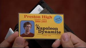
Both the professional titles of 'Napoleon Dynamite' and my own titles have both constructed that they have been done by hand and have not used titles from a particular program to show the titles. We have also used the right colour font to be shown on an appropriate background e.g. dark writing on a light background or the opposite. This has been constructed well and the titles can easily be identified because of this technique. The titles both appear near the start of the opening sequence, which is a similarity and probably to other drama films.
Setting/Location:


In 'Napoleon Dynamite' however, the setting and location is not fully identified. The only thing you see, as well as the titles, are different colored and materialized carpets, suggesting that the film's opening sequence is set in a living room, but the audience do not know that.
Camera/Editing:
There is a big difference between my final cut and 'Napoleon Dynamite'. In my opening sequence, I've used a range of continuity editing, such as jump cut and eye-line match, whereas in 'Napoleon Dynamite', there is only one piece of continuity (jump cut) between each carpets shown. As well as this, 'Napoleon Dynamite' has also used just one camera shot throughout, whereas in my opening sequence, I've used a wide range of camera shots to tell the story of my film. Two of these examples are the close-ups, when showing the character's reaction from reading the letter and his dad's number on the phone and also the point-of-view shots, when the protagonist is looking at the main props of the film's opening sequence. This creates effect for the viewer, by understanding the plot more clearly.
Title Font and Style:

 When looking at these 2 film's use of titles in their opening sequence (mine above and 'Napoleon Dynamite' below) we can see some similarities. The titles are near enough positioned in the same place (right in the centre of the screen) but the fonts look a little bit different. The titles are both hand-written, which is a similarity. The way it is written is both linked to a character or object ('Fathers Son' uses written text to refer to the font of the letter, which is a key prop for the film and 'Napoleon Dynamite' uses written text to refer back to the main character, who daydreams his way through school and draws ligers and other fantasy creatures). The titles in 'Napoleon Dynamite' appears almost in the same order as my film's opening sequence, with most of the title's hand-written on paper or doodling the plate using different creams and sauces etc.
No comments:
Post a Comment